
Monday , 09 September 2019 |
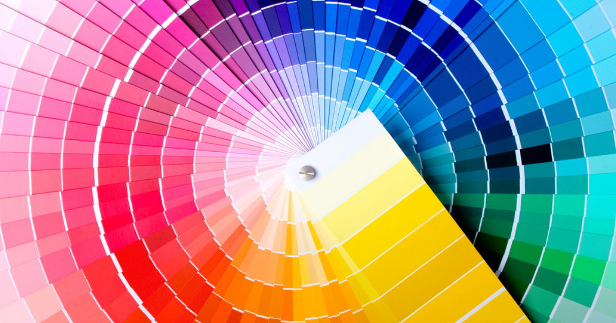
We all know a major part of a good design is choosing the right colors. And there's a reason for that. Not only does a good design need to be aesthetically pleasing but it needs to feel right. The mind connects colors to emotions, but what's really fascinating is how brands have been using this color theory for a long time. Let's take a quick look at what hues generate which emotions and then we'll show you how a brand can use this knowledge to their advantage.
What emotions do colors bring?
Warm Colors - When you think about warm colors like red, yellow, pink and orange you probably get a tingly feeling inside. It's called excitement! Those colors often bring about a positive, fun vibe.
Cool Colors - Blue, purple and green fall into this category. Overall, they provide a comfortable feeling, but each can really mean something different, as you'll see in the chart below.
Neutral Colors - Grey, silver, black, white, tan all represent calm and sophistication.
Before we move on, remember that everyone has their own opinion and these are more of a generalization. Additionally, it really matters how you use colors that determine how people feel towards them. Take a look at the chart below and then we'll dive into opportunities for brands to use color emotions.
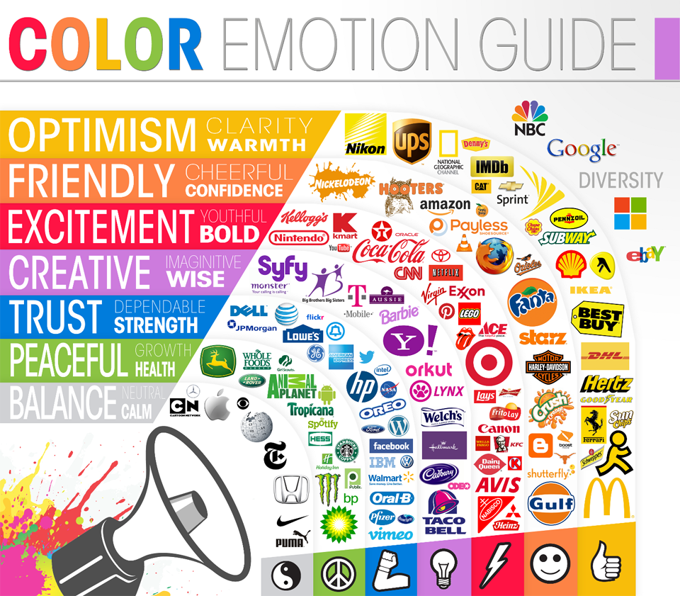
Image courtesy of The Logo Company
How brands can use color to evoke emotions
As you can see above, many brands have been using color theory in their logos for a long time. Moreover, they use it in their marketing in everything from digital ads, product selections, website design, print ads, televised commercials and SO MUCH MORE. Color theory is really part of it all. It's tied to your brand. Most companies strategically pick their logo and come up with a brand guide that dictates all the colors that can be used and the feelings they want their brand to elicit.
Green tones can represent a healthy, eco-friendly choice, whereas a dark purple can give something a premium look. Simple black and white designs often show that a brand is sleek and cutting edge. And a bright yellow wall graphic says "welcome, we're fun!"
Color matching in print marketing
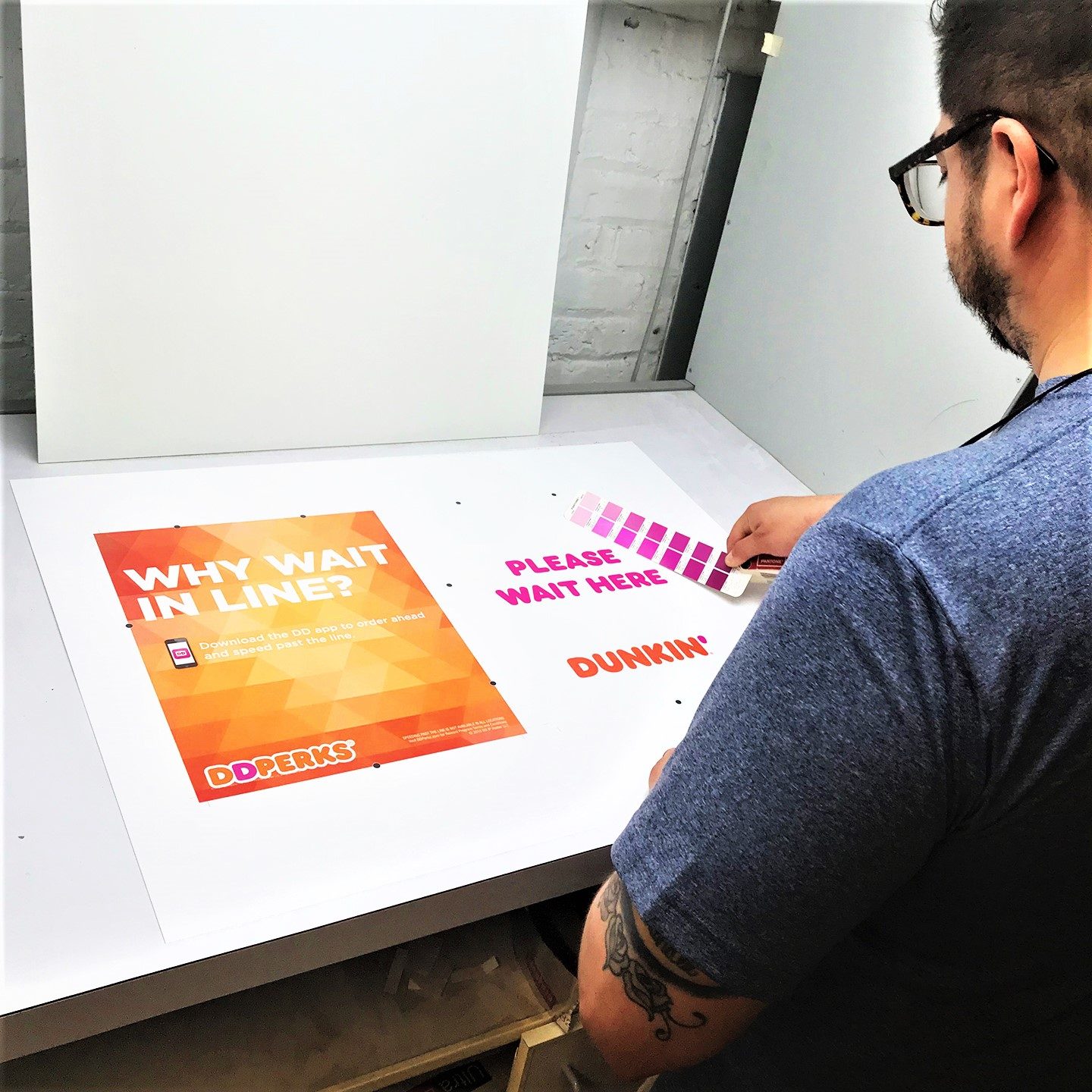
We're living in a digital world, but sometimes photos just don't capture the true richness or vibrancy of a color. That's where we come in. You want your printed materials to be the right color and we'll ensure that happens. At C2 Imaging we use the Pantone Matching System (PMS) to ensure your materials are on brand. And, if we're printing product photos, we can alter the design to make sure it looks just like the physical product. After all, we all hate when we fall in love with a product only to find that the real thing is a slightly different shade.
The next time your brand is designing a campaign, think about color and how you can use it to help convey your message. Contact us to learn how we can help your business with your next project.


Sep 09, 2019 |